web app • flow redesign
TeleHelp Ukraine
Reduced steps by up to 76% in the interpreter availability submission process in the organization’s internal web app
WHAT I DID
Survey, Wireframing, Prototyping, Usability Testing
TOOLS
Figma, Maze, Google Forms, Pitch, GitHub
TEAM
Maryna Korzhyk (Lead Back-End Developer), Hyeonyoung Park (Front-End Developer)
DURATION
November 2023 - March 2024
CONTEXT
TeleHelp Ukraine (THU) is a nonprofit telehealth organization that connects Ukrainians needing medical assistance to US, Europe, and Ukraine-based physicians.
3,500+ free video visits were provided to internally displaced persons and those near the front lines who lost their access to medical care
The internal web app and the role of interpreters
The THU internal web app is designed to streamline and automate volunteer work. One of the integral parts of the internal system is managing the availability of interpreters to ensure their presence during appointments. Interpreters help patients communicate with healthcare providers because most volunteer providers are based in the USA, and patients speak Ukrainian and/or Russian only.
PROBLEM
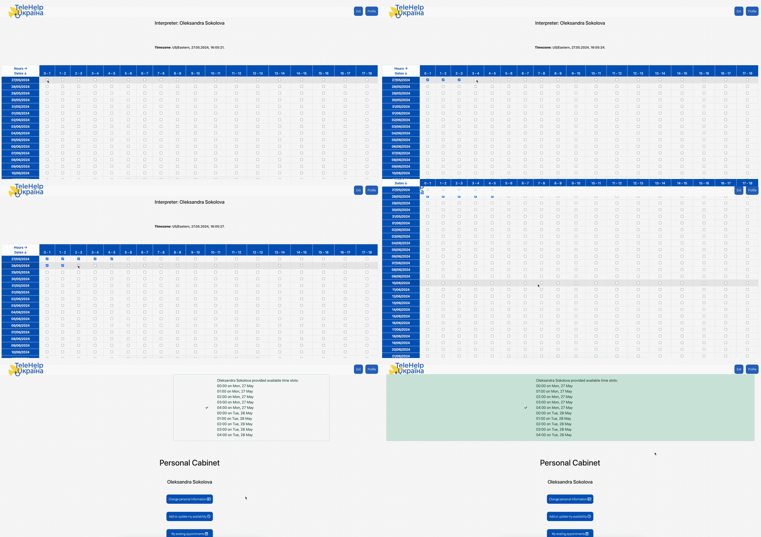
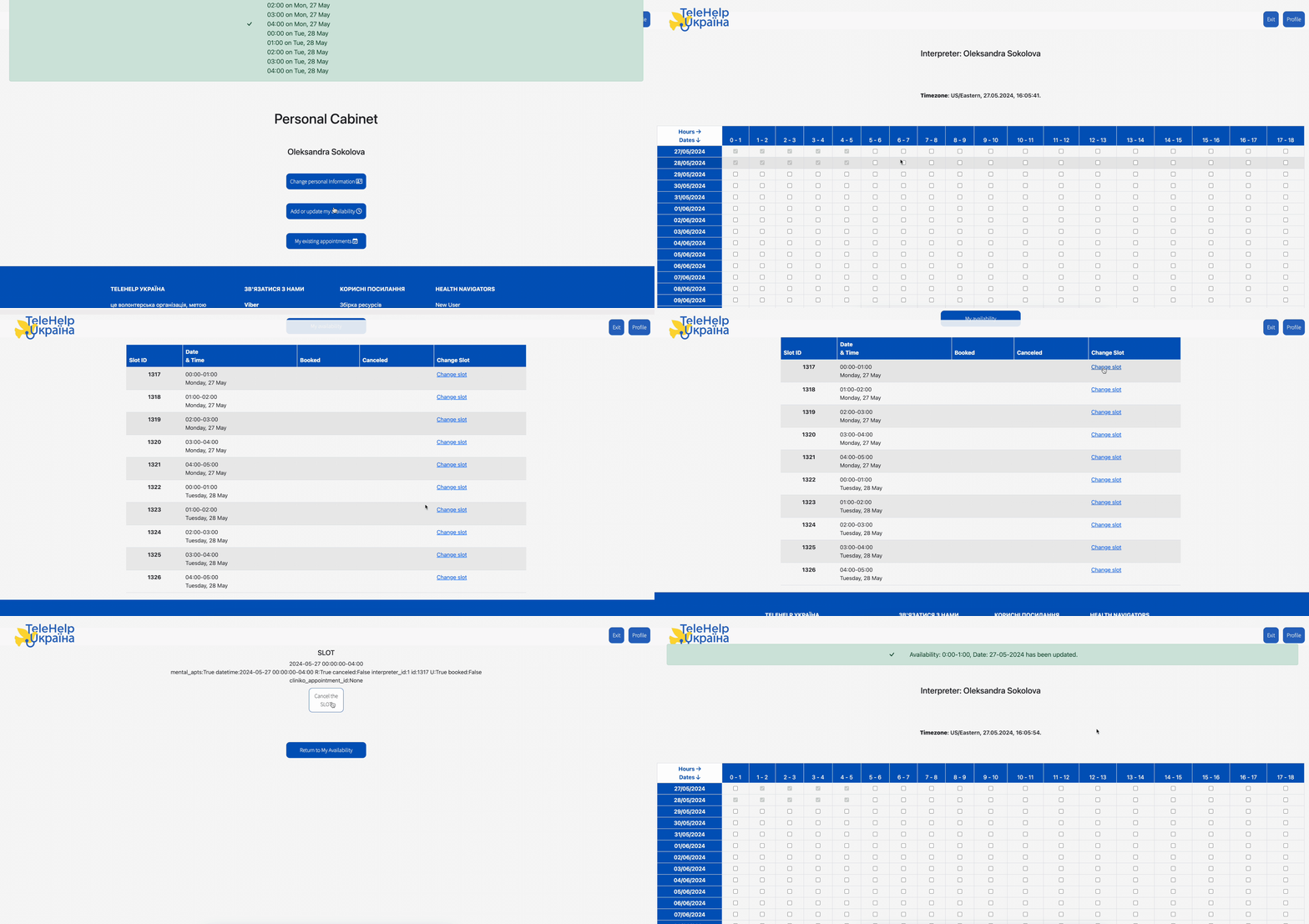
The availability form required interpreters to click on each time slot individually and manually cross-reference dates with a calendar to check the correct days of the week. This back-and-forth process was time-consuming and could lead to inaccurate entries.
DESIGN PROCESS FOR THIS PROJECT
SURVEY
I asked 7 interpreters about their experience of adding and removing availability in the app. I chose a survey as the primary research method because all people involved in the organization’s work, are volunteers, and this approach respects everyone's time and provides the flexibility to participate at their convenience.
The pain points
✦ There are no days of the week, only dates
✦ It requires a lot of clicking to select/deselect times
✦ Adding and removing availability require different procedures
✦ There is no option to remove multiple slots after submission, only cancel them one by one
What I recommended
I saw the opportunity to streamline the process by reducing the number of steps, decreasing cognitive load, and improving the overall ease of use.
MODERATED USABILITY TESTING
I conducted usability tests with 3 interpreters and asked them to submit their availability and share their thoughts as they were doing it.
The section “Apply to” caused the most confusion because they didn’t understand how it works.
FINAL SOLUTION
Main features
Booked slots can’t be removed
The primary purpose of this feature is not to allow interpreters to remove the booked slot and forget about their scheduled appointment to avoid last-moment cancellations and rescheduling, which can negatively impact patients’ experience and disrupt providers’ schedules.
UNMODERATED USABILITY TESTING FAILURE
Before conducting moderated usability testing, I ran unmoderated testing using the research platform Maze, expecting to gather insights on how interpreters interacted with the new availability submission flow. I opted for this method because it allowed participants to complete tasks at their own pace.
But it didn’t go well, and something caused participants to drop out of the testing process prematurely.
This is how the results looked.
The reason was the prototype with limited interactivity
I created a prototype with limited interactivity, and participants expected to interact with it as they would in a fully functional interface.
✦ Expectation vs Reality
“I like the look of the screen, but it’s hard to be more specific without being able to click around.”
When participants clicked on elements that didn't respond, they assumed they were doing something wrong.
✦ Feeling of error
“Somehow, I couldn’t make myself unavailable. My cursor didn’t open “make me unavailable”. I did something wrong :(”
Lesson learned
Next time, I’ll ensure the prototype allows for comprehensive interaction, so users can fully engage and provide valuable feedback.
Result
By redesigning the flow, we could speed up the process of filling out availability and decrease the number of steps by up to 76%*
With a faster and more intuitive process, interpreters can submit their availability with less effort and fewer errors, leading to more consistent and accurate scheduling. This minimizes scheduling gaps and improves the organization’s capacity to provide care for patients.
*Test scenario: submit a 3-hour availability for the next 8 Tuesdays:Old flow's total steps: (3 steps × 8 Tuesdays) + 1 save = 25 stepsNew flow's total steps: 5 steps + 1 save = 6 steps, which is 19 steps fewer
Interested to know more?
Feel free to reach out at oleksa.sokolova@gmail.com


